In my continuous pursuit of the perfect agency, I happened upon an unusual tidbit that I think we can all use.
It always surprises me to find anything online that I can directly relate to. I am forever wary of the monstrous, catacomb-like nature of the internet; while I know the information is out there i can never seem to find what it is I need.
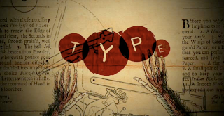
It seems that TAXI has hit the nail on the head with this website. This resource is a sort of informal how-to for the advertising rookie. Be sure to check it out, theres a wealth of resources and much needed advice on finding your place in the complicated world of Advertising and Design.
2/21/08
2/20/08
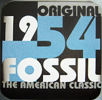
Fossil - packaging with true integrity
Theres something to be said for those who stay true to traditional standards of quality.
One of my favorite brands -one of the few brands which I see fit to endorse- is Fossil. The classic style and feeling that they strive to encapsulate for the consumer has hit home with me ever since I was given my first fossil watch a few years ago.
In packaging, I am a big fan of reusability. For me, the more uses something gets, the better I can justify the production of a product in the first place. With a Fossil Tin, not only have you got a work of art -a show piece if you will- I can say from experience that each tin in my ever growing collection has served a variety of functions in their own time.
I also feel that the use of their signature tins is reflective of the quality of products that they provide. I have yet to be dissappointed by the quality of fossil products each with leather trimming or a variety of other features.
Although I suppose the statement made by designing a tin for your product is that it is of a high level of quality. After all, what better way is there to imply that your new watch may still need a home in 5, 10, or 15 years.
I think this is what is missing from our consumer culture. It is remarkably rare that we would buy products that will last a lifetime. It seems Aldous Huxley knew what he was talking about in Brave New World when he supposed that our love of new products would be a driving force for industry "Ending is better than mending. The more stitches, the less riches"
My girlfriend Debbie recently gave me a book called 'Tinspiration' which is where I got these samples from. The book is a collection of tins arranged and photographed in interesting and unique ways indicative of the inspiration that went into each tin.
Labels:
Branding,
Consumer Culture,
Packaging,
Quality Products
I never liked her anyways...
well, well, It seems I finally know who my REAL friends are. With that sort of conduct I guess Hillary really deosn't care who I vote for. Lucky for her, this Canuck has no clout anways...
hillaryclintonisyournewbicicle.com
barackobamaisyournewbicicle.com
hillaryclintonisyournewbicicle.com
barackobamaisyournewbicicle.com
2/19/08
Letterpress typography
I was recently accumulating resources for a future blog entry and fell into a graphic designer's links page which led me on a strange journey through one fantastic site after another.
I eventually settled into the letterpress typography of Hammerpress, you may or may not recall seeing one of their designs in the TDC show this year; a concert poster for Sigur Ros.
I was taken by the design when I saw it the first time but had no expectations as to what other work the company had done. They have managed to layer colors and text in such a way as to create a retro-modern sort of appeal. I think that this sort of typography is dynamic in its playful composition. Here are some samples
2/11/08
The Wino - er... Wine Connoisseur Speaks on Design
As I am currently in the process of branding my winery, e?nigma, I have been paying even closer attention to the packaging of wines from different regions. I personally like the cost-value relationship of Australian and South African wines, but additionally these wines tend to have some of the most interesting and diverse packaging and brands on the shelves today.
I've been long bored by the gold embossing and delicate paper textures on wine bottles from italy and france. It was said to me recently that some feel that these characteristics are iconic of quality and prestige but I think this is hogwash. I may not be wealthy enough to appreciate the value of a $50 bottle of wine, but cost seems to be the only thing indicated by so-called 'fancy' packaging on these bottles.
I like to get a sense of mood from a bottle of wine; is it fun, sombre, delicate, exuberant, sensual? I cannot tell this from a fancy gold swash or an off-white label.
I prefer wines who attempt to create a sense of play or experimentation in the consumer, here are a few examples of 'fun' wine packaging:
Red Knot:
Kelly's Revenge:
South African wine - Obikwa:
My desire to create a mood for the consumer will be translated through the batch name where each batch will feature a dynamic and unusual name that when interpereted will indicate the qualities of the wine itself. eg. 'Glacial Sandstorm' (A dry wine best served chilled) etc.
Print Consumption: Delicious...
While I rarely have time to read in my daily life, I spend a disproportionate amount of time seeking out good design to fill my proverbial creative well.
My favorite magazine would have to be Idn, but I am also a frequent reader of Applied Arts, Juxtapoz, Toronto Life, Esquire, and Revolver. I am always looking for new design magazines because I always appreciate design more thoroughly when I am looking at the physical representation rather than the online version.
I do read the newspaper as well, The Toronto Star being the paper delivered to my home, and the National Post when I am at work. But truthfully, I read alot less in the real newspapers than I would in the rag editions like Metro etc, simply because it's not nearly as exhausting.
Otherwise, I read a lot of books on my off-time from class, we're trying to develop our library for our future 'study' -or home office- when we have a larger space than our apartment. I personally read alot of fiction such as Sci-fi, Satire, and alot of this being dystopian novels which I find fascinating. My favorite authors are John Wyndham, Kurt Vonnegut, and Chuck Palahniuk whose works are always steeped in social commentary(likely a primary source of my cynicism towards pop culture figures)
I also consume design texts above and beyond those recommended for classes, (see earlier post on the Stylepedia) and am a big fan of books published by Steven Heller or through Rockport.
Martin Kvamme - what strange music looks like
Some people may say that my taste in experimental music has long ago gone awry, an I might just be inclined to agree. It seems that my favorite musician Mike Patton is slowly losing his mind, in the most audibly pleasing way possible. His projects include numerous bands such as Mr. Bungle, Faith No More, Tomahawk, Fantomas, and a variety of more experimental and virtually incoherent jibberish.
While this blog entry does not directly concern his music, it does relate to his imprint label ipecac for whom Martin Kvamme designs a bulk of their packages and posters.
Tomahawk's Mit Gas:
These are detail shots of the hotfoil stamping featured on my favorite CD design. In fact, the CD itself is my favorite CD in part because of the contrast between the rough experimental sound and slick regal packaging. With CD design a great deal of how we interpret music is through perception.
I did some research and found that many of my favorite designs of late had been designed by martin for ipecac.
Fantomas' Directors Cut:General Patton Versus the X-ecutioners:
Peeping Tom:
Of late a great deal of his designs have been cardboard sleeves, which to me says alot about sustainable design in music packaging. Who needs a hundred jewel cases that will someday be cluttering either a landfill or consuming valuable resources to recycle.
Some Posters as well:
This guy apparently has my dream job, designing strange packaging for strange music... Someday I hope to be able to work with clients such as these.
2/10/08
Responsible Design
I think theres two ways to answer the question; 'what is the responsibility of a designer'. First, we should consider the economic and environmental impact of the messages we are sending. Secondly, I would have to say that the responsibility of the designer is to bridge the gap between
the client and the target audience.
In either case for me, my primary focus is to find ways to incorporate sustainability into my work wherever possible.
the client and the target audience.
In either case for me, my primary focus is to find ways to incorporate sustainability into my work wherever possible.
My mediated life
I sat down to analyze my personal usage of popular media outlets based on a one week period, and found that I do consume more media than I had expected. While I'm not at all surprised by the inclusion of 26 hours of MP3 listening because of the 14 hours a week I am on the bus, I was surprised that My web usage was as high as it is.
I had thought that I wasn't an internet reliant person, but it seems that I spend quite a bit of time between classes and during breaks from homework to constitute 11 hours of surfing.
What surprised me the most was the limited use of print media, I suppose that while the magazines I read are numerous, I am not spending as much time reading them as I thought. This must be due to my school and work schedule as there is always some sort of research to be done online that it would be far more time consuming to look through printed materials
Print
News- 2 hr
Magazine - 1 hr
Book - 1 hr
Web
Internet - 11 hr
Emails - 6
Entertainment
DVD - 7 hr
Music - 26 hr
Communication
Cell Phone - 15 min
Telephone - 1 hr
Text Messages - 3
I had thought that I wasn't an internet reliant person, but it seems that I spend quite a bit of time between classes and during breaks from homework to constitute 11 hours of surfing.
What surprised me the most was the limited use of print media, I suppose that while the magazines I read are numerous, I am not spending as much time reading them as I thought. This must be due to my school and work schedule as there is always some sort of research to be done online that it would be far more time consuming to look through printed materials
News- 2 hr
Magazine - 1 hr
Book - 1 hr
Web
Internet - 11 hr
Emails - 6
Entertainment
DVD - 7 hr
Music - 26 hr
Communication
Cell Phone - 15 min
Telephone - 1 hr
Text Messages - 3
Studio Profile: The Movement
An interesting design firm to be sure, The Movement is a Toronto firm whose work is unique and inspired. Their website scrolls along a horizontal time line displaying their past present and future work, when you click a link you are shot forward into the future to the desired link.
The diversity of this design group was impressive to me, working on both conventional and unconventional projects incorporating information graphics, packaging, advertising and a variety of other media.
These guys seem genuinely interested in the progression of design in terms of both their own designs and that of their competitors. The claim on their website is that they have a free desk for any designer who wants help bringing an innovative job to fruition... free of charge.
I am definitely going to be keeping an eye out for these guys in the future and hopefully someday I may have the opportunity to bring some unique concepts of my own to their doorstep.
2/9/08
Superbowl 2008
While I may not have strapped my brain into a machine to test the efficiency of the advertisements during the 2008 super bowl, I can definitely say that I was impressed with the diversity and creativity shown in their execution.
I find it difficult to summarize any one overriding theme, as many different subjects are discussed such as valentines day, self-help and general silliness. By and large the commercials were comedic in format and fairly well thought out conceptually. My favorite ads came from Saatchi & Saatchi, BBDO Worldwide, and Weiden & Kennedy.
I can definitively say that the 'Bob's house' ad from BBDO is my favorite ad of the superbowl season. The ad was targeted to a growing demographic of Deaf individuals, and was shot entirely in ASL(American Sign Language). No audio was used and even though I 'speak' passable ASL I was thankful that the ad was subtitled for people not fluent in sign language.
The ad seemed to be a branding piece for EnAble; a division of PepsiCo, as it was not intended to promote a product, but educate people and raise awareness of Deaf culture in a fun way.
My runner up for favorite would be between the career builder ads from Weiden & Kennedy(for their simultaneous depiction of one character as both hero and victim) , and the tide to go interview ad by Saatchi & Saatchi (Because they obscured all conversation and the ad was twice as effective).
2/8/08
The Blogosphere is a daunting place
I recently found some interesting work on the blog of a Cranbrook university student named JK Keller. He created an Illustrator Script he calls the Slitscan Type Generator that takes one character from every typeface on your computer and slices them all together.
This piece really interests me because I've always been a big fan of collage work. It's funny to be comparing this to traditional collage but in a sense its the same only he has replaced the scissors with a computer code that can do the job in a fraction of the time.
I find it really interesting now that I'm posting on my own blog to see what else is out there, its nice to see that tons of design students post their work on their blogs and get a considerable amount of traffic from people that want to see it.
Ease of Understanding: a designers credo
When thinking how to encapsulate such a complex subject as my own design theory, I think the ideal place to start is the end. What do I hope to accomplish as a designer?
While I may want to create pretty visuals and present dynamic content to the reader, I am always aware that this is what I want to do, not what I need to do. I know that in the end, what I need to accomplish is to effectively facilitate communication between the client and the consumer.
So, what is design?
Design is combining complimentary elements into a design in order to both draw in the viewer and move their attention in a dynamic way to each element in its on time. In essence, we as designers try to develop visual systems to help the eye ‘digest’ information in an effective and efficient way.
The Legacy of Steven Heller
I recently stumbled upon a website for Steven Heller’s Masters Series, and I find myself somewhat smitten with the man. How can he have written so many valuable books for both design literate and illiterate people?
Honestly, if you told me he wasn't human I doubt I’d be surprised. With over 100 books published in his name, he almost seems a fantasy figure, immune to human weakness and infinitely knowledgeable in the ways of design.
I’m sure a number of you have seen my Stylepedia, which I have been raving about ever since I bought it at swipe. But for those who haven't seen it, it’s an encyclopedia edited by Steven Heller that serves as an invaluable resource in creating authentic designs.The stylepedia has cross referenced topics all sorted alphabetically which makes the book so easy to navigate, you can find out anything you need to now about different periods and styles of design in mere minutes.
Klee's Synesthesia
To continue on the thread of influential artists, I'd like to elaborate on one of the Bauhaus artists whose work I have been drawn to since I was a child. Ever since I had the opportunity to check out a gallery of Klee's work, the strangeness of the forms and the impression of deep calculation has had quite a bit of influence on how I can now perceive art in an objective way.
As a child I was mainly drawn to the modern art appeal of the bulk of klee's work, where he creates seemingly random fields of colour painted on a rough canvas or burlap. As I grew interested in his teachings I eventually warmed up to what I had always taken to be untalented sketches. I simply had no concept of what he was trying to express, a short sight that I try relentlessly to correct in my current appreciaton of art.
This is a watercolor painting titled Abstract trio(1923)
This quote from a lecture on synesthesia written by Dr. Hugo Heyrman that could express more eloquently than I, what Klee's inspiration may have been.
In any case, It goes to show that excellent art is in the mind, not necessarily on the page.
As a child I was mainly drawn to the modern art appeal of the bulk of klee's work, where he creates seemingly random fields of colour painted on a rough canvas or burlap. As I grew interested in his teachings I eventually warmed up to what I had always taken to be untalented sketches. I simply had no concept of what he was trying to express, a short sight that I try relentlessly to correct in my current appreciaton of art.
This is a watercolor painting titled Abstract trio(1923)
This quote from a lecture on synesthesia written by Dr. Hugo Heyrman that could express more eloquently than I, what Klee's inspiration may have been.
In this watercolor we see an interaction between three forms —a configuration of growth, patterns and traces. They might represent the abstract sound patterns of three voices, or three instruments of a performing trio. The allusion to music is strengthened by the rhythmic interplay of lines and forms. Klee himself referred to the nervously line of his drawings as a form of 'psychic improvisation'. In the work of Klee, (like Kandinsky) there are many spiritual correspondences between music and the qualities of color and form (20).
In any case, It goes to show that excellent art is in the mind, not necessarily on the page.
Gonzo book design?
I dont know how, I dont know why, but somehow I have been unaware that my favorite artist redesigned one of my favorite books, resulting in the disturbingly illustrated 50th anniversary release of George Orwell's Animal Farm.
Ralph Steadman, the artist whose explosive style of illustration gave form to Gonzo journalism in the late 60's and early 70's, is commonly recognized for his work on Fear and loathing in Las Vegas written by Hunter S. Thompson.
It seems though that his work has been cropping up more and more lately. I for one miss the energy and excitement of real Gonzo journalism, however sadistic it may be.
2/2/08
The death and rebirth of print media
It has been said that the growing scope of the internet and digital media will eventually eliminate the necessity of printed media. I feel that this is a whole lot of hype, every time we (as a culture) develop a new technology it is heralded as the best invention, and the only invention we will ever need.
In almost all cases, the previous form of media has survived the shift only suffering the indignity of being considered kitsch. After all, vinyl was superceded by many forms of music storage and distribution systems, 8-track, cassettes, Cd’s, Minidisks, and eventually despite the dominance of MP3 players, vinyl seems to be making a revival.
I think we can be sure of the continuance of print media, and as designers we will begin seeing the use of print as having its own set of implied meanings. The tangibility of some work is indespensible, people consider and analyze the content to a greater extent while reading printed forms rather than digital. Thus, choosing print in the future may become a targeted solution for presenting complex concepts and ideas that may demand the readers’ full, undivided attention.
In summation, I think print will never die. But if it does, it will soon be reanimated in far more inventive applications -a zombie of sorts- hungry for the brains of consumers who want more than just another ordinary book.
Subscribe to:
Posts (Atom)