As most of you already know, I'm the apple campus rep for Humber College. This year I'll be around for all of the back to school activities which means that I'll be able to let all of the new students in on all the promos that are available.
Since no-one in 3rd year will be around for the back to school events I thought I would fill you all in on a deal that's seriously worth considering.
Buy an adobe creative suite with your new mac and not only will you get a student price on the mac itself(up to $200 off on the macbook pro), but you will get the adobe suite for up to $300 less than the adobe student discount. Forget $1200, forget $600, you can get it for around $350 depending on the suite.
I dont know if you've considered buying as a student, but we only have one more year to cash in on a good deal. Even less if you want to take advantage of the promotions, they're only available until October.
Get in touch with me anytime for more info.
6/5/08
4/21/08
Designing the future
Having spent the semester asessing my view of the design world and developing my personal design theories, I can see that there is no way to encapsulate my thoughts and feelings on design in only one paper. Above all else, design is an element of change, the rhetoric we use and the concepts we create are extensions of our need to communicate and change the world around us.
In the last 49 blog entries I have come to understand the value of challenging others to think critically about the world they live in. Whether my designs accomplish this fact, I dont know, but having seen examples of how designers can incite change in the world, I hope that I can rise to the challenge.
The Urban Forest Project
Creating Awareness for the environment is something that I am particularly tuned into, as a self proclaimed hippie I have a keen eye for dynamic eco friendly projects.
I found the Baltimore Urban Forest Project searching for poster competitions to enter. Some of the work is really great, clever and unique posters like Yeohyun Ahn's poster targeted to the large community of computer scientists and physicists which depicts a mathematical equation for growth.
My Compliments
My Compliments go out to the team involved in putting together the Black book affair for the graduating classes of 2008. My girlfriend Debbie participated in organizing the event pro-bono with her classmates from the public relations program. Its nice to see students work together towards a common goal, coordinating copywriters and designers as well as event decor and audio visual presentations.
As I am 'in the loop' with some of the basic activities related to design that take place at Debbie's work, Faye Clack Communications, I often hear how PR people often work with designers. Theres a ton of freelance opportunities out in the business world but we need to know where they are and how to get them.
Debbie has been tirelessly working to make sure things go off without a hitch throughout the busiest time of the semester so I think she definitely deserves my compliments.
Check out the pieces of work on the facebook group linked above, theres some great advertisements like this beautiful example of script typography designed by Meghan Lynch.
Illustrating the passage of time
One of my favorite illustrators of late is Olofsdotter, a sweedish artist whose illustrations are often minnimalistic but can be dramatic and decadent as well as gritty and dissident.
Her website and portfolio houses a chronological illustration (left) that interconnects across space and time as it were.
I would like to see more talented illustrators featured in advertisements, I think it adds so much personality. Heres an ad for divine chocolates that is right on the mark.
Her website and portfolio houses a chronological illustration (left) that interconnects across space and time as it were.
I would like to see more talented illustrators featured in advertisements, I think it adds so much personality. Heres an ad for divine chocolates that is right on the mark.
Design Power
I think that theres an enormous opportunity for designers and design educators to promote social change. Creative for a cause is an organization that promotes social responsibility in design. There are a ton of links to 'role models' and case studies- people and design firms who are using their power to make change.
I think people are fundamentally decent, but I don't feel that we are naturally compatible with one another. With modern technology moving forward at such a pace, the ethics of interaction are not keeping up.
Living in a city as multicultural as Toronto has give me a strong sense of how people perceive one another through filters, only seeing what they perceive to be negative qualities. I am a strong supporter of what the Dalai Lama calls 'a need for a Secular System of Ethics' that is non-theistic in nature.
So, As a designer I hope to promote decency and respect between people and a shift from seeing the world from the inside out to seeing it from the outside in. Change can only occur within, thus we should use our considerable communication skills to share what we know and provoke others to do the same.
Creative Education
Creativity
I had an unusual childhood. Well, unusual by todays standards anyways. Both of my parents are still married, and my three siblings are happy and (relatively) well adjusted. To say we were difficult kids to manage would be a grand understatement, all four of us had some degree of attention deficit disorder. Think of a wild pack of savages, put them in white collar suburbia, and you'd have a reasonably accurate idea of how we behaved.
Needles to say, many of my talents were overshadowed by my inability to perform academically, and few teachers were able to identify what it was that I DID do well. I was a comic book junkie ever since I was a kid, probably collecting and trading cards was an outlet for my social nature and my appreciation of good art(many of my trades were not strategic but aesthetic).
It wasn't until high school that I started to see myself as creative. Almo, my bro from back home, spent all of his time inventing comic book series that never went anywhere. So we developed an endless cast of characters as our creative outlet. While my skills as an illustrator are beginning to fade due to a preference for digital art, my skills were definitely developed through the amount of drawing and conceptualization I did in high school.
Education
My experience as a designer is actually relatively short. I never focused on communications in high school partly because the school I studied in was poorly funded and archaic. My perception of design was linked to advertising which was unfortunately a negative connotation because no-one ever bothered to dispel the perception that all advertising is evil. Maybe chalk it up to bad career counseling or a lack of awareness of the booming advertising industry of design.
Rather than risk wasting a degree in fine arts, I decided to pursue Youth and Addictions Counselling as I have always been a calm, trustworthy and social person. I felt that if I could make a difference in someones life that I would be able to enjoy my job. Upon moving into Toronto to study at George Brown, I discovered that the program I chose was not an appropriate fit, but fortunately I met a student studying graphic design while I was there.
That was when realized that if I wanted to combine my skill with words and people with my passion for art, I would be able to do so as a designer because of the collaborative nature of Graphic Design.
A Manifesto
As a design student my process is still relatively ill-defined, as such this manifesto represents the ideal circumstances in which I am able to produce my best work.
Follow YOUR Path to the End- While many stress the importance of process, no one can tell you the ideal way to create, that comes from within. The sooner you can find your own path, the better you will be able to express your concepts.
Seek Inspiration from Outside of Design- The best designs are the embodiment of an idea. Taking inspiration from an existing design means either boiling it down to the concept or struggling to mimic something you cannot fully understand.
Stand Back- Don't get too involved in your work, get an outside opinion, take a break and return with a fresh perspective, or just work on something else. You'll never work through your problems if you cant put them in perspective
Take Good Care of Yourself- Nutrition and rest are essential to the creative process. Sound design choices are made with a clear and open mind, and nothing dulls the decision making process like an all-nighter.
Seek Constructive Criticism- While critique is always invaluable, so much depends on your ability to communicate your ideas and get reactive feedback. Always explain your design choices as best you can or the feedback you receive will be based on perception rather than understanding. Never take criticism seriously if it is based on personal opinion or experience, there is no such thing as a universal rule.
Never Let Yourself be Satisfied- Being satisfied with an unfinished job implies that the concept has not lived up to it's full potential.
Learn from the People Around You- The best teachers are strangers and friends alike. Learn new lessons in a real context so that you can better apply the knowledge you gain.
Make Time for Experimentation- Always enter a project with an open mind and figure out what works best, otherwise you may find yourself stuck in a dead end.
The Meth Project
When looking for inspiration for an ad campaign Ive been working on, I found a series of jarring ads for a campaign against crystal meth. I was actually surprised that these ads could run on television or billboards due to the gritty depictions of violence and prostitution, but clearly this was the point - to shock the audience into hearing their message.
This is an excellent example of advertising that pushes boundaries and takes risks in an appropriate way. Their tagline "Not Even Once" sends a strong message to the target audience which is predominantly kids who havent tried meth and who will likely face peer pressure to do so.
The TV spots almost play out like mini horror movies, I don't know whether I support the messages being sent but given the circumstances, I would say that it's a necessary evil. Check out these spots, these are two of the more straightforward ones, others include references to girls selling their bodies for meth and children abusing their parents. Hardly suitable for daytime television.
4/14/08
Fill the well
I dont know if anyone else is feeling creatively sapped from their studies, but if so check out Fuel Your Creativity to fill the well.
Challenging the Standard Format of Modern Communication
Yes! This is exactly it! Check out these remarkable information design pieces. As I have been working on my own theories of design in my college studies, I cant help but recognize an excellent example of how design can remove the 'visio-rhetorical subtext' from something as commonplace as the news.
While I was drifting in the blogosphere I happened to stumble upon university student David Bowker's website, Designing the News. He has taken the text of various newspapers, dissected them, and reinterpereted them as the visual content of his designs.
I think this is a innovative way of thinking about distributing information. He has interpreted the text of one full week of the guardian and based a series of visuals and information graphics. I think this piece is an excellent example of how challenging the standard format of modern communication can produce such provocative and inspired designs.
4/13/08
Dsign is Visual Rhetoric
Visual Rhetoric is a form of persuasion that engages us on a subconscious level. We are subjected without ever being aware, to a variety of image-based persuasions in our daily life.
Everything we see has been designed to create some form of subliminal response. Whether it is the sleek, user friendly, ergonomic design of apple products, or the beautification of political candidates(a la Will(I)am), we are told how to perceive almost everything we interact with before ever being able to come to our own conclusions.
Often, by designing something to be representative of a quality such as elegant or edgy, we are merely positioning our design in opposition to its opposite quality: "This product is NOT cheap" etc.
I have created for my design object, a poster which can be read in a number of different ways. While the poster has been set up to allow the reader to read it in four different ways, essentially it presents two opposing perspectives on how awareness of this rhetoric can allow the designer and the consumer to interact.
Subtle, yes. But it effectively delivers my message that we can design in a way that allows people to come to their own conclusions, rather than presenting a flashy package that forces an impression upon the viewer. After all, nobody likes to be told what to think, do they?
4/1/08
The Mad Magazine Fold-in
This ones for Craig.
I remember being mystified by the mad fold-ins as a kid. since before I was old enough to fully grasp some of the political nuances of the comedy, I was delighted by the mystery of what may appear once the page was folded. Little did I know the rarity of this art form, apparently the same artist has been drawing them since the 1960's, Al Jaffee.
I found this interactive fold in showcasing his work on design observer. I was impressed not only by his work, but by the ability of modern technology to represent his work in such a remarkable way. After all, theres no more appropriate way to represent what could be considered one of the the earliest forms of interactive design, than by using it's modern counterpart. Check it out.
3/25/08
AIGA Conference - Command X - pt.2
A complex issue such as youth voting is certainly not one that can be tackled in a mere 24 hours. This is not to say that the contestants in this years AIGA - CommandX competition failed to do so, but unfortunately the ideas that were presented had such great potential that it was somewhat of a letdown to not see them through to their end.
Kelly Dorsey's campaign 'they wont expect it' is a prime example of this fact. I loved the cheeky attitude of the ads, but as the judges had suggested, the creative was not supported by a cohesive campaign and sadly it did not fulfill its potential.
I thought that all of the campaigns did an excellent job of reaching the target market in question, but what surprised me was how perceptive the contestants were.
Each of the contestants issued a challenge to the viewer, in Kelly's case it was more overt, but in Nichelle's campaign I was blown away by the subtlety and severity that were played against each other. Here, rather than hit the viewer over the head, Nichelle allowed them to ponder the message; you are incapable of making change unless you vote.
The minimalistic execution popularized by apple fit magnificently, and allowed the concept to fully shine through. This style has become incredibly popular, and in this setting it becomes apparent that what is becoming trendy in design spheres, is conceptually driven advertisements that do not colour the way the viewer interprets the message.
Type Search Engine?
Have you ever been looking for just the right typeface, but having no idea where to start looking, ended up using helvetica again? I recently found another useful tool for designers that will make an excellent addition to anyones typographic arsenal.
With Esperfonto, you can indicate what you need the typeface to communicate, what style you need(serif, sans and script), and even what other typefaces it needs to be used with.
Compiled by Will Harris, a writer and designer who has also provided a ton of type suggestions. While this should never be the end of a designer's search for the best faunt for the job, it should provide an excellent place to start.
Writing as Design
While Graphic design concerns itself predominantly with visualization, at its heart lays a concept or idea that can(and should) be expressed with words.
As we can all appreciate, writing is a form of design because both methods of expression aim to communicate a message to the viewer. On one hand you can say that writing is design because of the way we edit and revise ourselves until we have expressed ourselves clearly. On the other hand, design is writing because both are visual representations of the thoughts of the designer.
I often find that my best designs come from concepts that I can express to myself in less than 50 words. Abbreviating my concepts in such a way keeps me in check so that my concepts will make sense to other people and not just myself. I keep a small journal in my pocket or knapsack at all times. When I travel by public transit, I find that I am too self-conscious to sit and draw, so my notebook is where I do the majority of my brainstorming.
3/24/08
Miniature Earth
I mentioned in class about a video that approximates what a global cross-section would look like if 100 people represented the entire world population.
This is an excellent video that you should all check out, It'll give you a real sense of how privelaged we truly are. Plus, I think the directing is remarkable.
Here are a few stills:
This is an excellent video that you should all check out, It'll give you a real sense of how privelaged we truly are. Plus, I think the directing is remarkable.
Here are a few stills:
Pro Bono Pressure: Is a Graphic Designer Obliged to Work for Free?
No.
As a student hoping to acheive success and recognition in my field, there is no obligation for me to work Pro-Bono, there is a need. While I would not expect my peers to donate their time and energy for no payment, I would not hesitate to help an organization whose need was clearly defined. It is an excellent opportunity to give back to the community and gain recognition as a conscientious designer which is becoming more and more valuable in todays business world.
I do draw a line in terms of who I would consent to doing pro-bono work for. I would undoubtedly offer my services in full, free of payment to not-for-profit organizations whose beneficiaries are truly in need. I would not be willing to offer free services on the other hand, to companies who do stand to earn a profit from my work.
I think that there are too many not-for-profit organizations who need an extra push to be able to live up to their full potential. Often an organization will undervalue the benefit that design can bring to their overall efficiency, or else they simply cannot divert assets into design that could otherwise benefit their cause.
Looking for examples of agencies who do engage in pro-bono work, I found a website for a pro bono initiative:
The 1% is an initiative that connects not-for-profit organizations with architecture and design firms who have pledged 1% of their time to making the world a better place.
While this is a U.S. initiative, I would like to see something similar for graphic designers. Too often, people contribute to organizations based on the reputability of their brand, this restricts the number of people who would otherwise be interested in contributing to real grassroots initiatives that would improve the quality of life around us.
As designers it is not a matter of obligation, it is a matter of standing up for what we believe in, and doing what we can to help.
3/21/08
Designing the collapse of a moral society
What design work would I refuse?
In graphic design there are opposing views as to how a designer should approach controversial issues. Either suck it up and do the work regardless of the message, or take a stand and risk putting your neck on the line.
Where do I stand on the matter? as you may have already gathered from the title of this post, I couldn't bring myself to work on an indecent campaign if I tried. I should probably be fairly specific on this count for fear of my meaning being construed.
Now, I consider myself a progressive individual who respects the rights of people to do and (usually) say whatever they want so long as it is respectful of others. I can appreciate when a person who is true to themselves speaks their mind honestly, but what I cannot condone is advertising that has no benefit aside from selling a negative and socially destructive attitude.
The diesel ad pictured above was part of a larger campaign which featured men in provocative scenarios which would not have been so bad if not for the medium; these ads were regularly featured on outdoor billboards. These ad's(above and below) shared a billboard on the side of a building looming over Yonge street for nearly a year.
While I would not consider myself a prude, I could not condone building a brand that presented a glorified image of perversity. Yes, I understand that this campaign was likely intended for a European market, but I feel too strongly that this sort of advertising further undermines the positive values and self respect that we no longer embody.
It is fairly naive to think that I could get by as a graphic designer if I refused to work on any account that offended my values. I understand that extremes must be explored if a brand is to be differentiated. I disagree with placing an ad like this on a billboard, it seems more intended to push peoples boundaries than simply creating awareness.
A list of things I have learned thus far
Stephan Sagmeister is a designer and artist who has taken what he has learned through experience and expressed it through an assortment of large scale installation art pieces. He revisited the list from which the pieces were created at the 2007 TED conference which you can watch here.
In response to the list of things Stephan Sagmeister has learned so far, I too have boiled down what I now know into a short list of knowable truths.
I cannot control how my words, actions, or designs are interpreted.
I am responsible for my failings and successes.
karma will be repaid, for better or worse.
A mistake is often forgivable, taking for granted that it will be forgiven, is not.
Loving some(one/thing) is meaningless unless you express it.
When you love and respect yourself, others will too.
Stupidity ends with education, ignorance with love, and arrogance with defeat.
Losing control of my temper brings out the ugly side of the people around me.
My creativity is dependent on nourishment and rest.
I will never be completely satisfied by the quality of my own work.
While I cannot say that I look back favorably on the circumstances in which these lessons were learned, their value to me is incalculable nonetheless.
Advertising and Design: Driving Sales or Experience?
Not only is Graphic Design and Advertising moving towards providing an experience for the consumer, one design firm, Blast Radius specializes in what they call EXD or experience design.
I recently visited Blast Radius during this year's Emerging Designer's Conference, and while they have appropriated the acronym EXD to represent their process(which is almost entirely web-related) I think that it is indicative of the environment which we are training to participate within.
Modern businesses are built on cohesive brands that consumers can identify with. Thus developing products and services that play into an overriding user 'experience' is part of almost any modern business model. When we create an identity for a company or brand a product, this is ultimately what we are establishing.
At blast radius and throughout all of the tours at headstart, the common theme was to look at the end user, and reverse engineer the ideal user experience to ensure that people will respond to the media they are presented.
AIGA Conference - Command X
As a young designer, I know that designing for an audience would be a heartstopping trauma. For this reason, I am sympathetic to the designers featured on Command X during this year's AIGA conference.
The 7 designers who attempted the challenge were (in no particular order) Ryan, Matt, Elaine, Mike, Scott, Kelly, and Nichelle.
The challenge for part one was to redesign the Denver Bronco's logo. Alas I don't think these
guys were really sports enthusiasts, but their designs were at least founded in some amount of research.
My favorite design for this event was matt's modernist attempt at a sports logo, which came nowhere near what the clients would have wanted. For me, I liked the look of the logo, but it would not be a logo I would submit unless I had solid research that said the target market would respond to it.
We keep hearing the idea of including one revolutionary option amongst a few safer ones, when presenting concepts to a client, and this is definitely one of those logo's that was way off in left field. but given that he only had one logo, he did a damn good job creating an experience for the judges with his presentation.
I personally felt that the design that spoke best to the target was nichelles steam engine bronco. It communicated power and had an edge with the distressed linework.
I wont go so far as to pick on my least favorite designs, but I will say that I wasn't surprised with the depatures of Mike and Scott.
Design Resources: Design Float
One of the skills I think is extremely important to any designer, is being resourceful. Fortunately for me, ever since I got my Macbook Pro I can just pop in an address when it's mentioned in class and bookmark it to check out later. This has allowed me to find a ton of valuable stuff, from free stock art to tutorials, brushes, typefaces, and a ton of excellent inspiration.
Nowadays it seems that the only hobby I really invest any time in is meandering through the blogosphere. My favorite place to go on any good website is the links page. I can trace a path through 5 or 6 pages and forget where it was that I started. Today for instance I started on Design Float, followed a few links, and ended up with 3900 vector logo's that I have no idea who I downloaded them from.
I have been slowly circulating this link to a few people but here it is for the rest of ya'
Its a 'DIGG' style social media site that people contribute posts to from all over the net. theres tons of resources and inspiration posted on an hourly basis.
Labels:
Blogging,
Branding,
Design,
Illustration,
Interactive design,
Packaging,
Typography
Alternate Perspectives
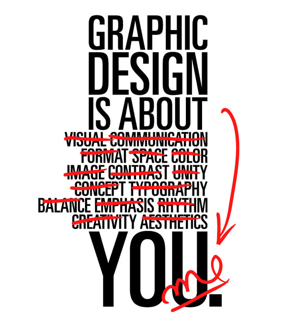
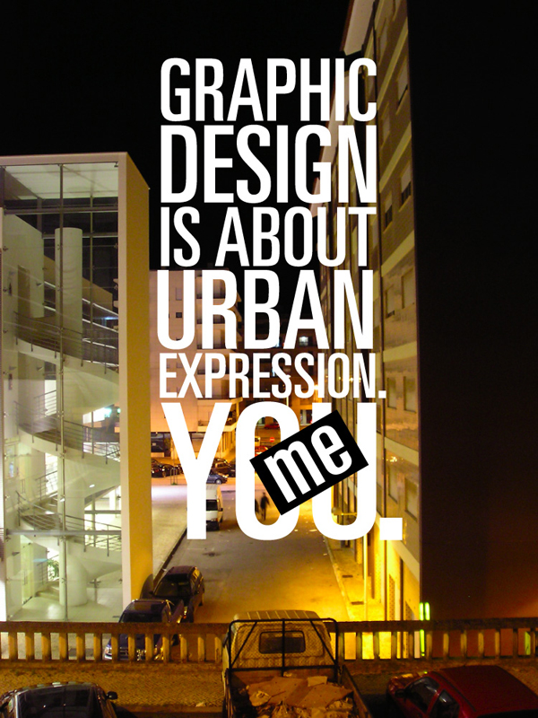
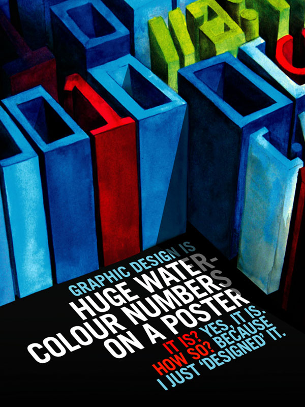
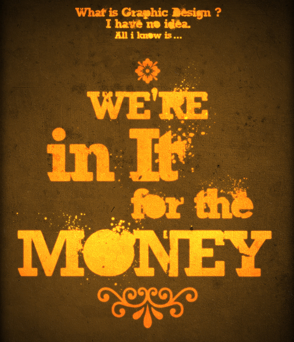
I recently found some work while meandering through the blogosphere that runs somewhat parrallel to the "Design is..." question that I have been engaged in answering.
The above piece is an excellent example of the painful search for what design means to us as designers. It is directly reflective of my personal attempt to narrow down all of the possible answers as to what design really is.
I found these and a variety of other examples of excellent type thinking and design here.
My Personal Design Theory Revisited
Having been asked to outline my personal design theory, I know that it can be an intensely personal journey to delve into our subconscious to pull out whatever it is we tap into. I have found that I have entirely too much to say on the topic so it has been difficult to narrow my focus to just one answer to the question: What is Design?
I personally feel that design(good design anyways) is visual rhetoric; a type of coercion which we are all receptive to on a subconscious level. We cannot help but respond to visual rhetoric because of the powerful way which our minds can automatically interpret visual information.
Think of a rhetorical question, it's intention is to present an idea, but rather than telling the listener what to think or do, it merely begs a question it has already answered.
For design to truly be a rhetorical question, we need to change the way we present the design, -if only slightly- so that the viewer is asked rather than told where to go next, even though we are leading them along a path of our own design.
In the end, if the goal of design is to entice the viewer into some form of action, the designs that are more effective are the ones that people have to think about. I think people will walk away from a rhetorical design feeling as though they can own the ideas they have taken from it, simply because they were asked -not told- what to think.
3/10/08
The hippest dog on the block
I don't know what exactly this says about the current state of graphic design, but once again the folks at DesignObserver have provided me with another sweet example of how the internet can appeal to all audiences.
If youve ever wanted to beatbox like a pro, check this out. This app lets you customize the flow, freestyling a variety of barks sniffs and scratches. Quite entertaining to say the least
3/2/08
10 things that make me happy
In this playful exercise I have been asked to summarize the things that make me happy. I suppose as a designer, the closer I can get to understanding what makes me happy, the better equipped I will be to make others feel the same.
10 things that make me happy:
1. Walking my dog after a snow storm
2. Admiring a finished design
3. the (rare) courtesy of others
4. Mike Patton
5. Science fiction and forward thinking
6. a peaceful, quiet, and uninterrupted chance to develop a concept
7. Down time for personal development (of which I have none)
8. Reacquainting myself with old friends
9. A full bodied red with a smooth yet slightly spicy finish
10. The love of a truly passionate and driven woman
2/21/08
My Big Future
In my continuous pursuit of the perfect agency, I happened upon an unusual tidbit that I think we can all use.
It always surprises me to find anything online that I can directly relate to. I am forever wary of the monstrous, catacomb-like nature of the internet; while I know the information is out there i can never seem to find what it is I need.
It seems that TAXI has hit the nail on the head with this website. This resource is a sort of informal how-to for the advertising rookie. Be sure to check it out, theres a wealth of resources and much needed advice on finding your place in the complicated world of Advertising and Design.
Subscribe to:
Posts (Atom)