3/25/08

AIGA Conference - Command X - pt.2


A complex issue such as youth voting is certainly not one that can be tackled in a mere 24 hours. This is not to say that the contestants in this years AIGA - CommandX competition failed to do so, but unfortunately the ideas that were presented had such great potential that it was somewhat of a letdown to not see them through to their end.


Kelly Dorsey's campaign 'they wont expect it' is a prime example of this fact. I loved the cheeky attitude of the ads, but as the judges had suggested, the creative was not supported by a cohesive campaign and sadly it did not fulfill its potential.


I thought that all of the campaigns did an excellent job of reaching the target market in question, but what surprised me was how perceptive the contestants were.

Each of the contestants issued a challenge to the viewer, in Kelly's case it was more overt, but in Nichelle's campaign I was blown away by the subtlety and severity that were played against each other. Here, rather than hit the viewer over the head, Nichelle allowed them to ponder the message; you are incapable of making change unless you vote.


The minimalistic execution popularized by apple fit magnificently, and allowed the concept to fully shine through. This style has become incredibly popular, and in this setting it becomes apparent that what is becoming trendy in design spheres, is conceptually driven advertisements that do not colour the way the viewer interprets the message.

Type Search Engine?


Have you ever been looking for just the right typeface, but having no idea where to start looking, ended up using helvetica again? I recently found another useful tool for designers that will make an excellent addition to anyones typographic arsenal.

With Esperfonto, you can indicate what you need the typeface to communicate, what style you need(serif, sans and script), and even what other typefaces it needs to be used with.

Compiled by Will Harris, a writer and designer who has also provided a ton of type suggestions. While this should never be the end of a designer's search for the best faunt for the job, it should provide an excellent place to start.

Writing as Design

While Graphic design concerns itself predominantly with visualization, at its heart lays a concept or idea that can(and should) be expressed with words.

As we can all appreciate, writing is a form of design because both methods of expression aim to communicate a message to the viewer. On one hand you can say that writing is design because of the way we edit and revise ourselves until we have expressed ourselves clearly. On the other hand, design is writing because both are visual representations of the thoughts of the designer.

I often find that my best designs come from concepts that I can express to myself in less than 50 words. Abbreviating my concepts in such a way keeps me in check so that my concepts will make sense to other people and not just myself. I keep a small journal in my pocket or knapsack at all times. When I travel by public transit, I find that I am too self-conscious to sit and draw, so my notebook is where I do the majority of my brainstorming.

3/24/08

Miniature Earth

I mentioned in class about a video that approximates what a global cross-section would look like if 100 people represented the entire world population.

This is an excellent video that you should all check out, It'll give you a real sense of how privelaged we truly are. Plus, I think the directing is remarkable.

Here are a few stills:


Pro Bono Pressure: Is a Graphic Designer Obliged to Work for Free?

No.

As a student hoping to acheive success and recognition in my field, there is no obligation for me to work Pro-Bono, there is a need. While I would not expect my peers to donate their time and energy for no payment, I would not hesitate to help an organization whose need was clearly defined. It is an excellent opportunity to give back to the community and gain recognition as a conscientious designer which is becoming more and more valuable in todays business world.

I do draw a line in terms of who I would consent to doing pro-bono work for. I would undoubtedly offer my services in full, free of payment to not-for-profit organizations whose beneficiaries are truly in need. I would not be willing to offer free services on the other hand, to companies who do stand to earn a profit from my work.

I think that there are too many not-for-profit organizations who need an extra push to be able to live up to their full potential. Often an organization will undervalue the benefit that design can bring to their overall efficiency, or else they simply cannot divert assets into design that could otherwise benefit their cause.

Looking for examples of agencies who do engage in pro-bono work, I found a website for a pro bono initiative:


The 1% is an initiative that connects not-for-profit organizations with architecture and design firms who have pledged 1% of their time to making the world a better place.


While this is a U.S. initiative, I would like to see something similar for graphic designers. Too often, people contribute to organizations based on the reputability of their brand, this restricts the number of people who would otherwise be interested in contributing to real grassroots initiatives that would improve the quality of life around us.

As designers it is not a matter of obligation, it is a matter of standing up for what we believe in, and doing what we can to help.

3/21/08

Designing the collapse of a moral society

What design work would I refuse?

In graphic design there are opposing views as to how a designer should approach controversial issues. Either suck it up and do the work regardless of the message, or take a stand and risk putting your neck on the line.

Where do I stand on the matter? as you may have already gathered from the title of this post, I couldn't bring myself to work on an indecent campaign if I tried. I should probably be fairly specific on this count for fear of my meaning being construed.

Now, I consider myself a progressive individual who respects the rights of people to do and (usually) say whatever they want so long as it is respectful of others. I can appreciate when a person who is true to themselves speaks their mind honestly, but what I cannot condone is advertising that has no benefit aside from selling a negative and socially destructive attitude.


The diesel ad pictured above was part of a larger campaign which featured men in provocative scenarios which would not have been so bad if not for the medium; these ads were regularly featured on outdoor billboards. These ad's(above and below) shared a billboard on the side of a building looming over Yonge street for nearly a year.


While I would not consider myself a prude, I could not condone building a brand that presented a glorified image of perversity. Yes, I understand that this campaign was likely intended for a European market, but I feel too strongly that this sort of advertising further undermines the positive values and self respect that we no longer embody.

It is fairly naive to think that I could get by as a graphic designer if I refused to work on any account that offended my values. I understand that extremes must be explored if a brand is to be differentiated. I disagree with placing an ad like this on a billboard, it seems more intended to push peoples boundaries than simply creating awareness.

A list of things I have learned thus far

Stephan Sagmeister is a designer and artist who has taken what he has learned through experience and expressed it through an assortment of large scale installation art pieces. He revisited the list from which the pieces were created at the 2007 TED conference which you can watch here.


In response to the list of things Stephan Sagmeister has learned so far, I too have boiled down what I now know into a short list of knowable truths.

I cannot control how my words, actions, or designs are interpreted.
I am responsible for my failings and successes.
karma will be repaid, for better or worse.
A mistake is often forgivable, taking for granted that it will be forgiven, is not.
Loving some(one/thing) is meaningless unless you express it.
When you love and respect yourself, others will too.
Stupidity ends with education, ignorance with love, and arrogance with defeat.
Losing control of my temper brings out the ugly side of the people around me.
My creativity is dependent on nourishment and rest.
I will never be completely satisfied by the quality of my own work.


While I cannot say that I look back favorably on the circumstances in which these lessons were learned, their value to me is incalculable nonetheless.

Advertising and Design: Driving Sales or Experience?

Not only is Graphic Design and Advertising moving towards providing an experience for the consumer, one design firm, Blast Radius specializes in what they call EXD or experience design.


I recently visited Blast Radius during this year's Emerging Designer's Conference, and while they have appropriated the acronym EXD to represent their process(which is almost entirely web-related) I think that it is indicative of the environment which we are training to participate within.

Modern businesses are built on cohesive brands that consumers can identify with. Thus developing products and services that play into an overriding user 'experience' is part of almost any modern business model. When we create an identity for a company or brand a product, this is ultimately what we are establishing.

At blast radius and throughout all of the tours at headstart, the common theme was to look at the end user, and reverse engineer the ideal user experience to ensure that people will respond to the media they are presented.

AIGA Conference - Command X

As a young designer, I know that designing for an audience would be a heartstopping trauma. For this reason, I am sympathetic to the designers featured on Command X during this year's AIGA conference.


The 7 designers who attempted the challenge were (in no particular order) Ryan, Matt, Elaine, Mike, Scott, Kelly, and Nichelle.

The challenge for part one was to redesign the Denver Bronco's logo. Alas I don't think these
guys were really sports enthusiasts, but their designs were at least founded in some amount of research.


My favorite design for this event was matt's modernist attempt at a sports logo, which came nowhere near what the clients would have wanted. For me, I liked the look of the logo, but it would not be a logo I would submit unless I had solid research that said the target market would respond to it.

We keep hearing the idea of including one revolutionary option amongst a few safer ones, when presenting concepts to a client, and this is definitely one of those logo's that was way off in left field. but given that he only had one logo, he did a damn good job creating an experience for the judges with his presentation.


I personally felt that the design that spoke best to the target was nichelles steam engine bronco. It communicated power and had an edge with the distressed linework.

I wont go so far as to pick on my least favorite designs, but I will say that I wasn't surprised with the depatures of Mike and Scott.

Design Resources: Design Float

One of the skills I think is extremely important to any designer, is being resourceful. Fortunately for me, ever since I got my Macbook Pro I can just pop in an address when it's mentioned in class and bookmark it to check out later. This has allowed me to find a ton of valuable stuff, from free stock art to tutorials, brushes, typefaces, and a ton of excellent inspiration.

Nowadays it seems that the only hobby I really invest any time in is meandering through the blogosphere. My favorite place to go on any good website is the links page. I can trace a path through 5 or 6 pages and forget where it was that I started. Today for instance I started on Design Float, followed a few links, and ended up with 3900 vector logo's that I have no idea who I downloaded them from.

I have been slowly circulating this link to a few people but here it is for the rest of ya'


Its a 'DIGG' style social media site that people contribute posts to from all over the net. theres tons of resources and inspiration posted on an hourly basis.

Alternate Perspectives

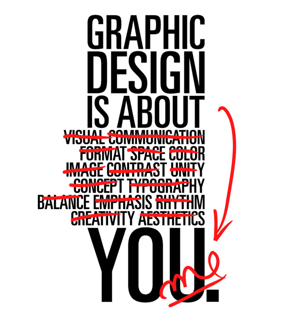
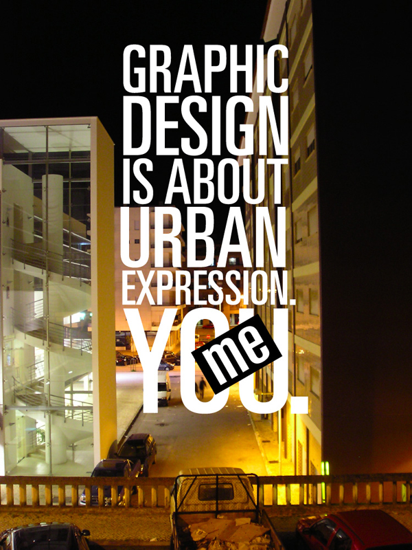
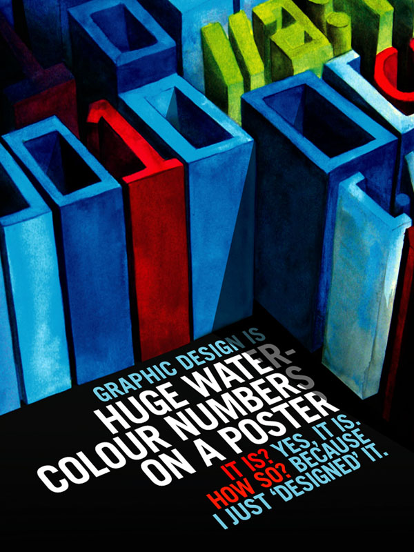
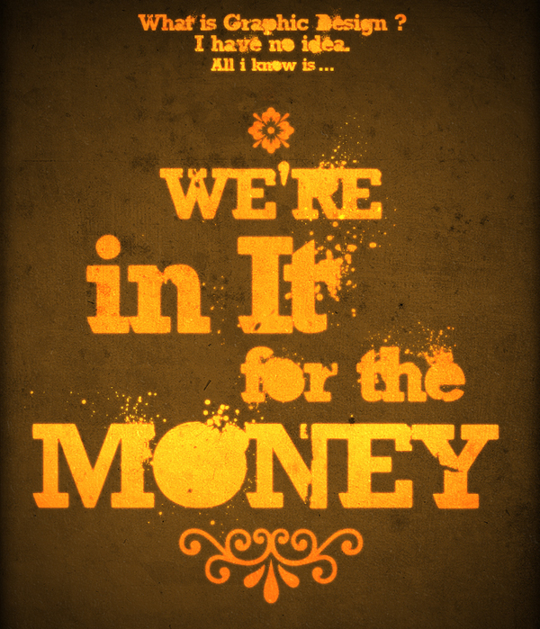
I recently found some work while meandering through the blogosphere that runs somewhat parrallel to the "Design is..." question that I have been engaged in answering.


The above piece is an excellent example of the painful search for what design means to us as designers. It is directly reflective of my personal attempt to narrow down all of the possible answers as to what design really is.


I found these and a variety of other examples of excellent type thinking and design here.

My Personal Design Theory Revisited

Having been asked to outline my personal design theory, I know that it can be an intensely personal journey to delve into our subconscious to pull out whatever it is we tap into. I have found that I have entirely too much to say on the topic so it has been difficult to narrow my focus to just one answer to the question: What is Design?

I personally feel that design(good design anyways) is visual rhetoric; a type of coercion which we are all receptive to on a subconscious level. We cannot help but respond to visual rhetoric because of the powerful way which our minds can automatically interpret visual information.

Think of a rhetorical question, it's intention is to present an idea, but rather than telling the listener what to think or do, it merely begs a question it has already answered.

For design to truly be a rhetorical question, we need to change the way we present the design, -if only slightly- so that the viewer is asked rather than told where to go next, even though we are leading them along a path of our own design.

In the end, if the goal of design is to entice the viewer into some form of action, the designs that are more effective are the ones that people have to think about. I think people will walk away from a rhetorical design feeling as though they can own the ideas they have taken from it, simply because they were asked -not told- what to think.

3/10/08

The hippest dog on the block

I don't know what exactly this says about the current state of graphic design, but once again the folks at DesignObserver have provided me with another sweet example of how the internet can appeal to all audiences.


If youve ever wanted to beatbox like a pro, check this out. This app lets you customize the flow, freestyling a variety of barks sniffs and scratches. Quite entertaining to say the least 

3/2/08

10 things that make me happy

In this playful exercise I have been asked to summarize the things that make me happy. I suppose as a designer, the closer I can get to understanding what makes me happy, the better equipped I will be to make others feel the same.

10 things that make me happy:

1. Walking my dog after a snow storm
2. Admiring a finished design
3. the (rare) courtesy of others
5. Science fiction and forward thinking
6. a peaceful, quiet, and uninterrupted chance to develop a concept
7. Down time for personal development (of which I have none)
8. Reacquainting myself with old friends
9. A full bodied red with a smooth yet slightly spicy finish
10. The love of a truly passionate and driven woman