Showing posts with label Packaging. Show all posts

3/21/08

Design Resources: Design Float

One of the skills I think is extremely important to any designer, is being resourceful. Fortunately for me, ever since I got my Macbook Pro I can just pop in an address when it's mentioned in class and bookmark it to check out later. This has allowed me to find a ton of valuable stuff, from free stock art to tutorials, brushes, typefaces, and a ton of excellent inspiration.

Nowadays it seems that the only hobby I really invest any time in is meandering through the blogosphere. My favorite place to go on any good website is the links page. I can trace a path through 5 or 6 pages and forget where it was that I started. Today for instance I started on Design Float, followed a few links, and ended up with 3900 vector logo's that I have no idea who I downloaded them from.

I have been slowly circulating this link to a few people but here it is for the rest of ya'


Its a 'DIGG' style social media site that people contribute posts to from all over the net. theres tons of resources and inspiration posted on an hourly basis.

2/20/08

Fossil - packaging with true integrity

Theres something to be said for those who stay true to traditional standards of quality.


One of my favorite brands -one of the few brands which I see fit to endorse- is Fossil. The classic style and feeling that they strive to encapsulate for the consumer has hit home with me ever since I was given my first fossil watch a few years ago.


In packaging, I am a big fan of reusability. For me, the more uses something gets, the better I can justify the production of a product in the first place. With a Fossil Tin, not only have you got a work of art -a show piece if you will- I can say from experience that each tin in my ever growing collection has served a variety of functions in their own time.

I also feel that the use of their signature tins is reflective of the quality of products that they provide. I have yet to be dissappointed by the quality of fossil products each with leather trimming or a variety of other features.

Although I suppose the statement made by designing a tin for your product is that it is of a high level of quality. After all, what better way is there to imply that your new watch may still need a home in 5, 10, or 15 years.

I think this is what is missing from our consumer culture. It is remarkably rare that we would buy products that will last a lifetime. It seems Aldous Huxley knew what he was talking about in Brave New World when he supposed that our love of new products would be a driving force for industry "Ending is better than mending. The more stitches, the less riches"
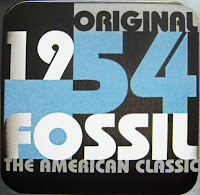


My girlfriend Debbie recently gave me a book called 'Tinspiration' which is where I got these samples from. The book is a collection of tins arranged and photographed in interesting and unique ways indicative of the inspiration that went into each tin.

2/11/08

The Wino - er... Wine Connoisseur Speaks on Design


As I am currently in the process of branding my winery, e?nigma, I have been paying even closer attention to the packaging of wines from different regions. I personally like the cost-value relationship of Australian and South African wines, but additionally these wines tend to have some of the most interesting and diverse packaging and brands on the shelves today.

I've been long bored by the gold embossing and delicate paper textures on wine bottles from italy and france. It was said to me recently that some feel that these characteristics are iconic of quality and prestige but I think this is hogwash. I may not be wealthy enough to appreciate the value of a $50 bottle of wine, but cost seems to be the only thing indicated by so-called 'fancy' packaging on these bottles.

I like to get a sense of mood from a bottle of wine; is it fun, sombre, delicate, exuberant, sensual? I cannot tell this from a fancy gold swash or an off-white label.

I prefer wines who attempt to create a sense of play or experimentation in the consumer, here are a few examples of 'fun' wine packaging:

Red Knot:

Kelly's Revenge:

South African wine - Obikwa:

My desire to create a mood for the consumer will be translated through the batch name where each batch will feature a dynamic and unusual name that when interpereted will indicate the qualities of the wine itself. eg. 'Glacial Sandstorm' (A dry wine best served chilled) etc.